

The Ultimate Figma to Code Workflow in 7 Proven Steps

Figma to Code Workflow: How to Build Pixel-Perfect, Production-Ready Websites
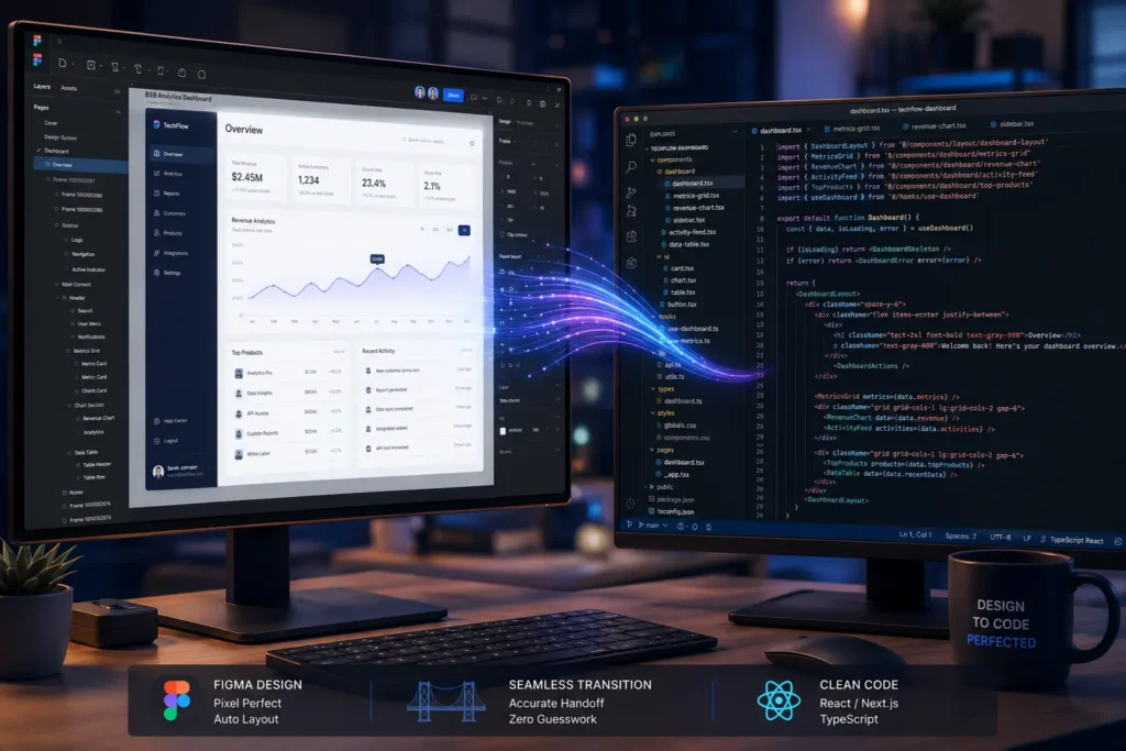
Introduction: Where Great Projects Win or Fall Apart
Let’s be honest. How many times have you seen a design that looked absolutely stunning in Figma, only to open it in the browser and feel a little disappointed? The colors feel slightly off. The spacing isn’t quite right. That smooth animation now stutters on mobile. Sound familiar?
This is one of the most common problems in web development today, and it costs businesses a huge amount of time and money every single year. The gap between what a designer imagines and what a developer ships is not just a technical problem — it is a communication problem, a process problem, and sometimes a mindset problem.
A proper Figma to code workflow fixes all of that. It is not just a checklist you follow before handing off a file. It is a way of working — a shared language between designers and developers that makes the whole team faster, the final product better, and the client happier.
In this guide, we are going to walk through everything you need to know. From how to think about your design system, to how to set up your code environment, to how to make sure your finished site loads fast and ranks well. Whether you are a developer, a designer, or someone who manages both — this guide is for you.
1. Start With the Right Mindset: Design is a System, Not a Picture
Before anyone opens a code editor, the foundation has to be right. And the foundation starts in Figma.
The biggest shift you need to make is this: stop thinking of your design as a picture and start thinking of it as a system. A picture is something you look at. A system is something you build with. When your design is a system, everything becomes easier — the handoff, the development, the updates, and even the future redesigns.
Building With Atomic Design
One of the best ways to think about your design system is through a method called Atomic Design. The idea is simple. You break your entire interface down into small, reusable pieces — just like building blocks.
At the smallest level, you have Atoms. These are your basic elements: a button, an input field, a color, a font size. On their own, they do not do much. But they are the foundation of everything else.
Next come Molecules. These are small groups of atoms that work together — like a search bar that combines an input field and a button, or a card that combines an image, a heading, and a link.
Then you have Organisms. These are bigger sections of your page, like a navigation bar, a hero section, or a testimonial block. They are made up of molecules and atoms working together.
When your Figma file is built this way, something really useful happens. Every single part of your design maps directly to a component in your code. When a designer updates a button color, the developer knows exactly which component to update. There is no confusion, no back-and-forth, no “which button did you mean?”
Design Tokens: The Secret to Consistency
Design tokens are one of the most powerful — and most underused — tools in a modern Figma to code workflow. A design token is simply a named value. Instead of saying “this text is #1A1A2E,” you say “this text is color-primary.” Instead of saying “this padding is 16px,” you say “this padding is spacing-md.”
When you connect your Figma variables directly to your CSS variables or your Tailwind config file, something magical happens. You update one value in one place, and it changes everywhere across the entire project. No more hunting through hundreds of files to change a brand color. No more inconsistencies between pages. Everything stays in sync, automatically.
This is the kind of workflow that saves teams weeks of work over the lifetime of a project.
2. Setting Up Your Development Environment the Right Way
Most developers do not think much about project setup. They pick a framework, create a folder, and start building. But the decisions you make at the very beginning of a project will follow you all the way to the end — for better or worse.
Choosing the Right Framework
In 2026, the two most popular choices for building production websites are React and Next.js. React is great for interactive, state-heavy applications. Next.js builds on top of React and adds server-side rendering, which means your pages load faster and rank better in search engines.
The big shift happening right now is the move toward Server Components in Next.js. The idea is simple: instead of sending a huge bundle of JavaScript to the browser and asking it to build the page, you build as much of the page as possible on the server and send clean HTML to the browser. The result is a much faster page, especially on mobile devices and slower internet connections.
For most B2B websites and landing pages, Next.js with Server Components is the right choice in 2026. It gives you the best performance, the best SEO foundation, and a developer experience that is hard to beat.
Why TypeScript is Not Optional
A lot of developers avoid TypeScript because it feels like extra work at the start. And honestly, it is — a little. But the time you spend setting up types at the beginning saves you ten times that amount later on.
TypeScript is basically a safety net for your code. It tells you when you are trying to use a component in a way it was not designed for. It tells you when a required piece of data is missing. It catches errors before they ever reach the browser.
In a Figma to code workflow, TypeScript is especially useful because it lets you define exactly what data a component needs, and in what format. This makes components much easier to reuse, much easier to test, and much easier for new team members to understand.
External Link: Official TypeScript documentation → https://www.typescriptlang.org/docs/
3. How Designers Can Make Life Easier for Developers
If you are a designer reading this, here is something worth knowing: the way you organize your Figma file has a huge impact on how long development takes and how accurate the final result is. A messy Figma file is one of the most common causes of delays, confusion, and poor outcomes in web projects.
Here are three habits that make a real difference.
Use Auto-Layout Everywhere
Figma’s Auto-Layout feature is the visual equivalent of CSS Flexbox and Grid. When you use Auto-Layout in your design, you are essentially telling the developer: “this is how this element should grow, shrink, and arrange itself.” When you do not use it, developers have to guess — and guesses lead to misalignments.
Get into the habit of building every frame with Auto-Layout from the start. It takes a little more time upfront, but it makes the handoff so much cleaner.
Name Everything Consistently
Imagine opening a codebase where every file is named “Component1,” “Component2,” and “Component3.” It would be a nightmare. The same is true for Figma files with layers named “Rectangle 47” and “Group 12.”
Use a clear, consistent naming system. Something like Btn/Primary/Large or Card/Product/Default tells both the designer and the developer exactly what they are looking at. When your design library and your code library use the same names, finding and updating components becomes much faster.
Document Your Components
Use Figma’s Properties and Variants features to document exactly how each component behaves. What happens when a button is hovered? What does a card look like when it has no image? What are the different states of an input field?
A developer should never have to guess the intent of a design. All of that information should be visible right there in the design file.
4. Building Components the Right Way: From Canvas to Browser
This is where the actual development happens, and the key principle is simple: build small, build reusable, and build clean.
Presentational vs. Container Components
One of the most useful concepts in component-driven development is the separation between presentational components and container components. It sounds technical, but the idea is very straightforward.
A presentational component only cares about how something looks. It takes in some data, displays it in a certain way, and that is it. It has no idea where the data came from. It does not make any API calls. It does not manage any complex state. It just shows things.
A container component, on the other hand, handles all the logic. It fetches data, manages state, and passes everything down to the presentational components that need it.
Why does this matter? Because when your visual layer is completely separated from your logic layer, your components become incredibly portable. You can take a card component from one project and drop it into another without bringing any unwanted baggage with it. You can test it in isolation. You can update its appearance without touching any business logic.
Using Storybook to Stay Aligned
Storybook is a tool that lets you build and review components in complete isolation, outside of the main application. Think of it as a living catalogue of every component in your project — every button, every form, every card — in every possible state.
This is incredibly useful for Figma to code workflow alignment. When a designer wants to check if a component matches the original design, they can open Storybook and see it instantly, without needing to navigate through the whole application. When a new developer joins the team, they can get up to speed by browsing Storybook and understanding the full component library before writing a single line of code.
5. Performance Is Not Optional: Making Your Site Fast
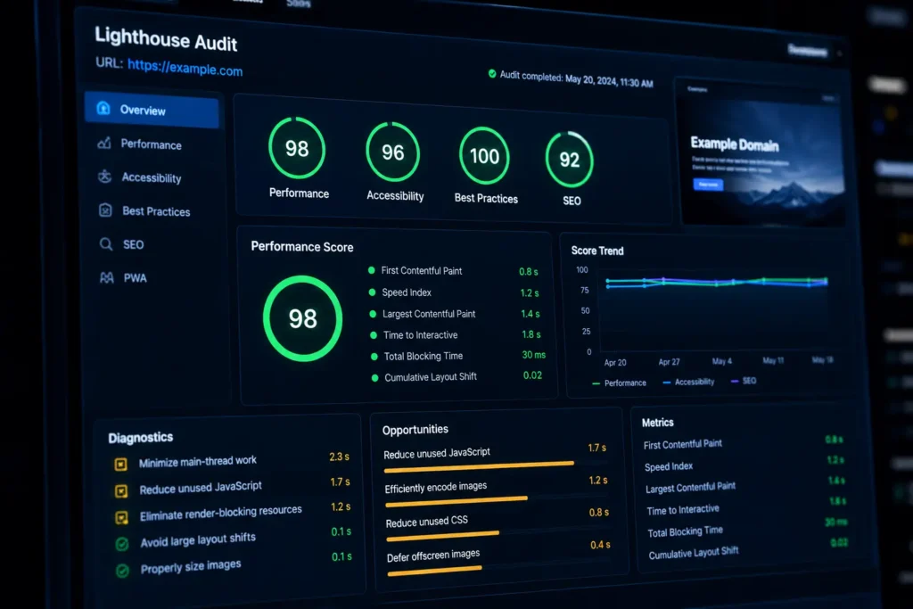
A website that matches a design perfectly but takes five seconds to load is not a success — it is a failure. In 2026, users expect pages to load in under two seconds. Search engines penalize pages that do not meet performance standards. And on mobile devices, slow pages are simply abandoned.
Performance has to be part of your Figma to code workflow from the very beginning, not something you try to fix at the end.
Understanding Core Web Vitals
Google measures page performance using three key metrics called Core Web Vitals.
The first is Largest Contentful Paint, or LCP. This measures how long it takes for the main content of your page — usually the hero image or headline — to appear on screen. A good LCP score is under 2.5 seconds. To achieve this, make sure your hero images are compressed, converted to WebP format, and loaded with priority.
The second is Interaction to Next Paint, or INP. This measures how quickly your page responds when a user clicks a button or fills in a form. A good INP score is under 200 milliseconds. Heavy JavaScript and poorly optimized animations are the most common causes of a bad INP score.
The third is Cumulative Layout Shift, or CLS. This measures how much your page layout jumps around as content loads. You know that frustrating experience when you are about to click a button and the page shifts and you accidentally click something else? That is a CLS problem. Always define dimensions for images and avoid inserting dynamic content above existing content.
Practical Performance Tips
Always convert images to WebP or AVIF format before uploading them. These formats are significantly smaller than JPEG or PNG with no visible quality loss.
Use code splitting and dynamic imports. Instead of loading your entire JavaScript bundle when the page first loads, only load what is needed for the current page. Load everything else on demand.
Inline your critical CSS — the styles needed to render the above-the-fold content. This prevents the browser from waiting for an external stylesheet before it can display anything.
Remove unused CSS and JavaScript. Tools like PurgeCSS can automatically strip out styles that are not being used, which can reduce your CSS file size dramatically.
External Link: Google’s Core Web Vitals documentation → https://web.dev/vitals/
6. Real-World Case Study: Turning a Slow Site Into a Sales Machine
We recently worked with a B2B software company that was struggling with a serious performance problem. Their main landing page was taking nearly seven seconds to load on a standard mobile connection. Unsurprisingly, their conversion rates were poor and their bounce rate was very high.
When we audited the site, the design itself was actually quite good. The problem was entirely in the translation from design to code. The development team had used a heavy page-builder plugin that generated bloated, redundant HTML. Every page was loading fonts, scripts, and stylesheets that were not even being used. Images were being served as high-resolution PNGs with no compression.
We rebuilt the page using a proper Figma to code workflow. First, we extracted all the SVG assets directly from Figma and minified them. We converted every image to WebP format and set up lazy loading for everything below the fold. We removed the page builder entirely and replaced it with clean, hand-written component code. We shifted the rendering strategy to server-side using Next.js, which dramatically reduced the JavaScript bundle size.
The results were significant. Page load time dropped from seven seconds to just under 1.8 seconds. Their Lighthouse performance score went from 34 to 94. Within three months, their lead conversion rate had increased by 40%, and their cost per lead dropped because they needed to spend less on paid traffic to hit their pipeline targets.
The lesson here is simple: performance is not a technical detail. It is a business outcome. A fast website makes you more money. A slow website costs you money, every single day.
7. How to Handle Disagreements Between Designers and Developers
In any project where creative people and technical people work closely together, there will be moments of tension. A designer wants a complex parallax scrolling effect. A developer says it will hurt performance. A designer wants a custom animated cursor. A developer says it will break on mobile. Who is right?
The honest answer is: both of them, and neither of them.
The designer is right that visual creativity and attention to detail matter. The developer is right that performance and technical feasibility are real constraints, not excuses. The solution is not for one side to win — it is to find an approach that respects both.
We recommend something we call a Technical Handoff Meeting. Before any development begins, the designer and the lead developer sit down together and go through the design file, section by section. The developer flags anything that could cause a performance problem or is technically difficult to implement. The designer explains the intent behind each decision. Together, they find a solution that captures the design intent without compromising performance.
For example, a complex parallax scrolling animation might be replaced with a simpler CSS transform that achieves a similar visual feeling with far less performance cost. A custom animated cursor might be simplified to a clean CSS hover effect that works perfectly across all devices.
The key mindset shift is this: constraints are not the enemy of creativity. They are the conditions under which real creativity happens. When you know what you cannot do, you find smarter ways to do what you want.
8. Quality Assurance: Making Sure What You Built Is What Was Designed
Shipping code is only half the job. The other half is making sure it actually works the way it is supposed to — across different browsers, different devices, and different screen sizes.
Visual Regression Testing
Visual regression testing is a process where automated tools take screenshots of your live components and compare them to a reference image from the design file. If anything has changed — even a single pixel — the tool flags it for review. This is one of the most effective ways to catch unintended changes before they reach production.
Cross-Browser Testing
A layout that looks perfect in Chrome might break in Safari. A font that renders beautifully on Windows might look slightly different on macOS. Always test your work across multiple browsers and operating systems before shipping. Pay particular attention to Safari on iOS, which still has some quirks that other browsers do not.
Accessibility Auditing
Accessibility is not a bonus feature — it is a baseline requirement. Every component you build should be keyboard-navigable. Every image should have a meaningful alt text. Every form field should have a proper label. Every color combination should meet WCAG contrast ratio requirements.
Not only is this the right thing to do, it is also good for SEO. Search engines reward pages that are accessible and well-structured. And in many markets, accessibility is increasingly a legal requirement for business websites.
9. Where AI Fits Into the Figma to Code Workflow in 2026
There is a lot of excitement — and a lot of confusion — around AI-assisted coding right now. Tools like GitHub Copilot and various AI code generators can produce boilerplate code quickly, and they are genuinely useful for certain tasks. But it is worth being honest about what they can and cannot do.
AI is very good at generating repetitive code. If you need to create twenty similar components that follow the same pattern, an AI assistant can speed that up significantly. It is also useful for writing unit tests, generating documentation, and suggesting solutions to common problems.
What AI is not good at is architectural thinking. It cannot look at a complex design system and decide how to structure your component library. It cannot weigh the trade-offs between different rendering strategies. It cannot anticipate how your codebase will need to evolve over the next two years. Those decisions still require experienced human judgment.
The best Figma to code workflows in 2026 use AI as an assistant, not as a replacement. Senior engineers focus on architecture, component design, and performance strategy. AI handles the repetitive, time-consuming parts. The result is a team that moves faster without cutting corners on quality.
FREQUENTLY ASKED QUESTIONS (FAQ)
How much automation should I use in my Figma to code workflow?
Automation is a great tool, but it works best when a human is guiding it. AI code generators can speed up boilerplate work, but they are not good at making architectural decisions. Use automation for the repetitive tasks — generating similar components, writing unit tests, formatting code — and save your human judgment for the decisions that actually matter: how to structure your system, how to handle edge cases, and how to balance design fidelity with performance.
What does “production-ready” actually mean?
Production-ready code is code that is ready to handle real users in the real world. That means it meets performance standards — ideally a Lighthouse score above 90 across all categories. It means it is written in TypeScript with proper types defined, so errors are caught before they reach users. It means it has been tested across multiple browsers and devices. And it means it is documented well enough that another developer can pick it up and understand it without needing to ask ten questions.
Will this process make my project take longer?
At first, it might feel like it is slowing you down. Setting up a design system, defining tokens, and building a component library takes more time at the start than just jumping straight into building pages. But here is what happens without that foundation: every change takes longer than it should, every new page requires rebuilding things from scratch, and every bug fix risks breaking something else. The upfront investment in a proper Figma to code workflow consistently makes projects faster overall, not slower.
How do we keep our design and code consistent as the project grows?
The best tool for this is a living style guide — a Storybook instance that catalogues every component in your system, in every possible state. When a designer updates a component in Figma, the corresponding Storybook story gets updated too. When a developer builds a new component, it goes straight into Storybook. This way, both the design and the code are always referencing the same single source of truth.
Is accessibility something we handle at the end of a project?
No — and this is one of the most common and costly mistakes teams make. Accessibility has to be baked in from the very first component you build. If you wait until the end and try to add accessibility on top of existing code, it is a massive amount of work. But if you write semantic HTML from the start, define focus states for every interactive element, and test with a screen reader as you go, it adds very little time to the overall process. Build it right the first time.
How do you handle design changes that come in during development?
This is where a component-based system really earns its value. When your UI is built from reusable components, a change to one component automatically propagates everywhere that component is used. So if a designer updates the style of a primary button, you update the button component once in the codebase and every single button across every single page reflects the new style instantly. The key is that your components have to be truly modular and reusable — not copied and pasted in multiple places.
What is the most important thing to get right in a Figma to code workflow?
Communication. All the technical tools and processes in this guide are valuable, but they only work if designers and developers are genuinely talking to each other throughout the project. The design system, the naming conventions, the component structure — all of these are shared agreements. And shared agreements only work when both sides are involved in creating them. Invest in that communication early, and everything else becomes much easier.
CALL TO ACTION
Ready to turn your designs into something that actually works as well as it looks?
At MarkupMarvel, we have built a Figma to code workflow that we have refined across hundreds of projects. We know how to translate a design perfectly, build components that last, and deliver sites that are fast, accessible, and easy to maintain.
More Blog

High-Availability Cloud Infrastructure: 5 Proven Steps

Nginx Redis Caching Optimization: 6 Proven Speed Tactics

Content Optimization for AI Search: 5 Proven Steps to Rank



