
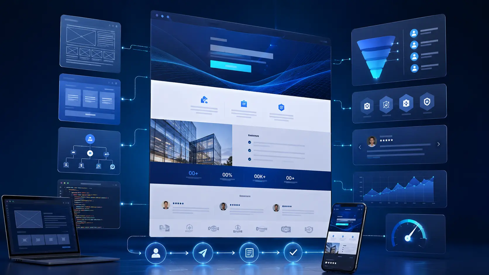
B2B Landing Page Design: 4 Proven Strategies That Convert

B2B Landing Page Design: 4 Proven Strategies That Convert
Let’s be honest — most B2B landing pages are not doing their job.
They look decent in a browser preview. The colors are on-brand. The copy is clean. But when a real prospect lands on the page from a paid ad or an organic search result, nothing happens. They scroll for a few seconds, feel nothing, and leave.
That is not a design problem. That is an architecture problem.
High-converting B2B landing page design is not about making things look beautiful, though that matters too. It is about building a page that earns trust in the first three seconds, communicates value without making the visitor work for it, and gives them one clear, compelling reason to take the next step.
In 2026, the stakes are even higher. B2B buyers are doing their research on mobile, using AI-powered tools to shortlist vendors, and making snap judgments about your brand based on how fast your page loads and how clearly it answers their questions. If your page is slow, structurally messy, or written in corporate buzzwords, you are losing deals before a conversation even starts.
This guide covers what actually separates a B2B landing page that converts from one that just exists — component architecture, mobile-first engineering, semantic SEO, Core Web Vitals, and the mistakes that quietly kill even the most expensive web builds.
What a Weak B2B Landing Page Design Is Actually Costing You
Here is a number worth sitting with: the average B2B deal takes six to nine months to close and involves somewhere between six and ten decision-makers. Your landing page is often the very first impression every single one of those people forms about your company.
If that page loads slowly, communicates unclearly, or looks like it was built years ago, the damage is done before your sales team ever picks up the phone.
Speed Is Not a Technical Detail — It Is a Trust Signal
When a page takes more than three seconds to load, something subtle but real happens in the mind of a professional buyer. Every uncompressed image, every render-blocking script, and every unnecessary tracking tag on the page is quietly chipping away at that first impression before a single word of your copy has been read.
The metrics that matter most here are straightforward. Largest Contentful Paint, which measures how quickly your main content appears, should land under 2.5 seconds so your value proposition is visible almost instantly. Interaction to Next Paint, which measures responsiveness, should stay under 200 milliseconds so buttons and links never feel sluggish. Cumulative Layout Shift, which measures visual stability, should stay under 0.1 so the page does not jump around while someone is trying to read it.Together, these form the backbone of what Google calls Core Web Vitals, and they directly shape whether a visitor trusts your brand within the first few seconds.
AI Search Has Changed the Rules for B2B Visibility
Tools like Google’s AI Overviews, Perplexity, and ChatGPT’s search features do not just match keywords anymore — they read your page roughly the way a careful human would. A page built on unstructured markup with no clear heading hierarchy and no schema is, for practical purposes, nearly invisible to these systems, no matter how good the writing actually is.
The Long Game — Building for Scale, Not Just Launch
A component-based page architecture solves a different problem entirely: scalability. When your landing page is built from a library of reusable, well-documented components, your team can launch new campaign variants in days rather than weeks, and run A/B tests without needing an engineer involved in every iteration.
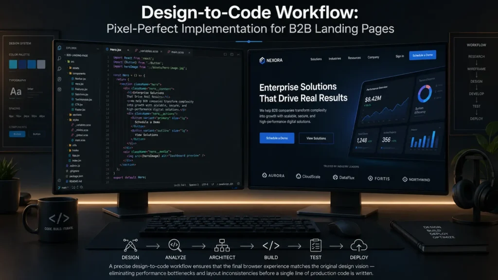
Picture this scenario, because it happens constantly. A designer spends three weeks crafting a beautiful landing page in Figma. Six weeks later, the page goes live, and it looks almost like the design, but not quite. The fonts are slightly off. The spacing feels different. And the page scores somewhere in the fifties on Google PageSpeed Insights.
Design Files Are Hypotheses, Not Instructions
When developers receive a design file without enough context, they end up making judgment calls — how should this button behave on hover, what happens at this specific screen width, what should an empty state actually look like. Those small, unavoidable judgment calls accumulate, and the live page slowly drifts away from what was originally designed.
Thinking in States and Breakpoints
Effective B2B landing page design in 2026 means designing for every state an element can realistically be in, not just its default appearance. Buttons need defined states for default, hover, focus, active, disabled, and loading. Forms need states for default, filled, error, and success. And layouts need explicit designs at common breakpoints — typically 1440px, 1024px, 768px, and 375px — rather than assuming a single desktop layout will simply scale down cleanly.
The Hidden Cost of Technical Debt
Every time a design decision gets made without considering how it will actually be implemented, a small amount of technical debt gets created. The most cost-effective fix is not better documentation after the fact — it is involving developers in design reviews from the very beginning, before decisions get locked in.
4 Proven Strategies That Drive B2B Landing Page Conversions
Strategy 1 — Build a Component System, Not a Page
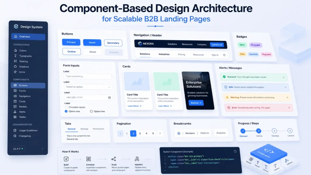
Instead of constructing a new page from raw materials every single time, build a set of standardized blocks once and reuse them everywhere. In practical terms, these are your components — hero sections, testimonial cards, pricing tables, CTA modules — each built, tested, and documented a single time. When one of those components needs to change, you change it once, and every page using it updates automatically rather than requiring a developer to manually edit a dozen separate pages.
Strategy 2 — Win the First Three Seconds
You have roughly three seconds before a buyer decides whether your page is worth their continued attention. The most effective above-the-fold structure tends to follow a simple, repeatable pattern: a headline that states the exact outcome the buyer gets, a subheadline that adds one specific layer of context, two to four recognizable client logos as trust signals, and a single high-contrast call-to-action button. Anything beyond that competes for attention rather than supporting the one decision you actually need the visitor to make.
Strategy 3 — Treat Performance as a Design Requirement, Not an Afterthought
Performance budgets need to be established during the design phase, not discovered during a frustrating post-launch audit. That means setting maximum image weights upfront, enforcing strict font file limits, and ruling out JavaScript-dependent animations above the fold entirely. Treating speed as a design constraint from day one is dramatically cheaper than trying to claw back performance after a page has already shipped.
Strategy 4 — Start With 375 Pixels, Not 1440
Designing mobile-first forces real prioritization. A small screen simply cannot fit everything a desktop layout can, so the team is forced to decide what genuinely matters most to the visitor. That clarity of priority, somewhat counterintuitively, almost always produces a better desktop experience too, since the same discipline carries over.
The Technical Foundation: SEO, Semantics, and Schema for B2B Landing Pages
Heading Hierarchy Is Not a Styling Choice
Heading tags create the actual semantic outline of your page, and search crawlers — along with AI systems reading your content — rely on that outline to understand what the page covers. Each page should use exactly one H1 containing your primary focus keyword, H2 tags for the major topical sections, and H3 tags for the sub-points nested within those sections. Skipping a level or using headings purely for visual size rather than structure makes the page genuinely harder for both search engines and AI tools to parse correctly.
Schema Markup Is Your Page’s Introduction to AI Systems
For B2B landing pages specifically, a handful of schema types matter most. FAQPage schema makes your content eligible for featured snippet placement. Organization schema establishes a clear entity identity for your brand. BreadcrumbList schema clarifies where this page sits within your overall site structure. And WebPage schema supports the broader E-E-A-T signals that both traditional search and AI systems increasingly weigh when deciding whether to trust and cite a page.
Mistakes That Quietly Kill B2B Landing Page Conversions
– Designing for desktop, then fixing for mobile: Scaling a desktop-first design down to a phone screen produces a page that technically functions but feels cramped, cluttered, and clearly secondary. Mobile needs to be designed as its own experience, not an afterthought.
– Animations that frustrate rather than delight: Scroll-triggered animations and heavy parallax effects often feel slow and stuttery on real mobile networks, even if they look smooth on a developer’s high-end laptop. If an animation does not directly help the user convert, it is worth removing.
– Copy that describes the service instead of the outcome: A line like “we provide enterprise-grade solutions” tells a buyer almost nothing. A line like “we reduce your cost-per-lead by 28 percent within 90 days” is specific enough to actually get a meeting booked.
– No CMS means no iteration: If changing a single headline requires pulling in a developer, marketing loses the ability to run meaningful A/B tests, and every test that does not happen is a missed opportunity to improve conversion rate.
– Vague social proof: Real, convincing social proof names the client, their title, their company, and a specific, quantified result. A generic five-star rating with no name attached carries almost no persuasive weight by comparison.
Why Component Architecture Is the Right Bet for B2B Landing Page Design in 2026
If you are making a genuine long-term investment in your landing pages, building on a modular component architecture from the start is worth the upfront effort. Build each element once, build it well, and deploy it everywhere it is needed. When something needs to change, you change it in exactly one place, and every page using that component updates automatically.
The teams that will outperform their competitors over the next several years are not necessarily the ones with the best individual landing page. They are the ones with the most agile, iterable digital infrastructure behind it — the ones who can test, learn, and ship changes in days rather than waiting weeks for a developer’s availability to open up.
How MarkupMarvel Approaches B2B Landing Page Design
At MarkupMarvel, we do not hand a finished design off to developers and hope it survives the build process intact. We treat design and engineering as a single, continuous process from the first wireframe through launch. Our work covers the full stack — component library architecture, performance engineering, CMS integration, and semantic HTML — because a landing page that looks right but loads slowly or confuses an AI crawler is still failing at its actual job.
This approach connects directly to the performance work covered in our guide on Nginx and Redis caching optimization, since a landing page is only as fast as the infrastructure serving it. Pairing strong frontend component architecture with a properly tuned backend is what actually gets you consistently fast load times rather than a page that scores well in a one-off test and then degrades under real traffic: https://markupmarvel.com/nginx-redis-caching-optimization
If you are a scale-up preparing a major demand generation push, this is the kind of infrastructure that lets you run campaigns at speed rather than waiting on engineering for every new variant.
Frequently Asked Questions About B2B Landing Page Design
Q: Why does my live page look different from the original design file?
A: This almost always happens because responsive behavior was not explicitly defined during the design phase. The fix is to define exactly how each element should behave at every breakpoint within the design file itself, and to run cross-browser testing continuously rather than only at the end of the project.
Q: Should I use a template or invest in custom code for a B2B landing page?
A: For B2B organizations that are serious about performance and long-term scalability, custom code is generally the better investment. Templates tend to ship with a significant amount of unused code that slows the page down and limits what you can realistically build later.
Q: How do I improve my B2B landing page’s visibility in AI search tools?
A: Focus on three things together: content that is semantically structured with a clean heading hierarchy, technical performance that scores well on Core Web Vitals, and schema markup that gives AI models the structured data they need to cite your content with confidence.
Q: What is the single most important element for B2B landing page conversion?
A: Clarity. Your value proposition needs to be immediately understandable. If a visitor cannot answer “why should I trust this company” within the first screen, the rest of the page rarely gets a chance to do its job.
Q: Can you improve the performance of a B2B landing page that already exists?
A: Yes. A proper audit covers Core Web Vitals, a review of the existing codebase, and an assessment of the CMS architecture, resulting in a prioritized list of improvements rather than a vague “make it faster” recommendation.
Q: Is component-based design difficult or expensive to implement?
A: There is a real upfront investment in planning and collaboration between design and engineering. That said, the return on investment tends to show up almost immediately, since per-page development cost and time-to-launch both drop substantially once the component library exists.
Q: How long does it actually take to build a high-converting B2B landing page?
A: A single focused page built on an existing component library typically takes one to two weeks. A more comprehensive multi-page site built from a custom component system from scratch usually takes six to twelve weeks, depending on complexity.
Final Thoughts
Your landing page is, in a very real sense, your best salesperson. It works around the clock, makes a first impression on every single visitor, and either earns the next step or quietly loses the deal before your sales team ever gets involved.
B2B landing page design done well is not about chasing trends or making something look impressive in a screenshot. It is about deliberately engineering trust, clarity, and speed into a page that has to do real work — converting strangers into pipeline, consistently, at scale.
More Blog

High-Availability Cloud Infrastructure: 5 Proven Steps

Nginx Redis Caching Optimization: 6 Proven Speed Tactics

Content Optimization for AI Search: 5 Proven Steps to Rank



